Sunday, December 13, 2009

Final Crit Images

Hey all,

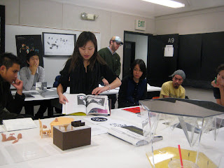
Hope everyone is having an excellent first weekend of freedom! Here are a few pics from the final crit. Wish I could have shot more and gotten everyone, but my camera died. It was great seeing all of the incredible work. It was highly inspiring.

xx,

jaime


Wednesday, December 9, 2009

thank you

Dear all,

I want to thank you for your work, commitment and dedication for what has been an incredible instance in being. The work you presented today was extraordinary: intelligent, committed and insightful. I am honoured and humbled by what you exhibited today, and i extend my deepest gratitude to you all. My 'job' is a labour of love, and it is nothing without you; a set of courageous thinkers who are willing to explore that which makes us human: questioning what we do not know or understand; love and commitment to what we do.

Always remember one thing: you are made of incredible beauty, and you can achieve anything.
This is not about the ego, this is about the heart, and the inexplicable mystery it holds.
Release it, share it, stay true to it, for that is the only thing that counts.

I hope to stay in touch, and once again let these over-used words reverberate in you:
thank you (& always dream big!)

carolina

-------------------

"I am not interested in the stable core of the known, but in the turbulent edge of the barely conceivable"
—Marcos Novak


"we are intervals between infinity"
—Carolina Trigo

-------------------

pd: don't forget to submit your work for the gallery

Wednesday, December 2, 2009

++PLEASE SEE POST BELOW MEDIASCAPES FOR WHAT'S DUE NEXT WEEK FOR YOUR FINAL PRESENTATION!!! VERY IMPORTANT

MEDIASCAPES SCREENING / NOT TO BE MISSED / TOMORROW EVENING AT SCI-ARC


Tomorrow evening at sci-arc's main space (keck hall). Mediascapes is the program I teach at at sci-arc. Hope to see you there / thxs / c

(click on image to enlarge)

CLASSROOM SETUP SPECIFICATIONS


please click on image to enlarge

+++FINAL PRESENTATION+++++ PLEASE TAKE NOTE

Dear all, we are merging both studios for our final. See Below
------------------------------------------------------------------------------

FINAL PRESENTATION PARAMETERS: looks dense, but its just very detailed and specific to avoid any confusion.

Below are the specifications on how I want the class to be set up for your final presentation (sketch, up for revision on site if need be)
The format will be an open / public exhibition of the work you have created this term in Transmedia (both studios combined)
Two of you (alexis and jesse) have classes at that time. Please advise on when you can drop by to present your work during break, we will accommodate.

i will invite colleagues and I invite you to spread the word to your peers as well. Nico Sala is designing our promo poster which should be up in school friday.

Exhibition time: 2:30-7pm. Open critique led by Carolina Trigo
location: room A9 / annex

We will begin the critique at 2:30 pm, meaning an extra 30 min to set up, so please get there a bit early (1:30pm)
as we need to arrange the tables and projectors.
Tables should be covered by white butcher paper for a very clean, elegant and professional presentation.
Butcher paper should drape to the ground on longer lateral sides of table.

-----------------------------------------------------------------------------------------
WORK:
Below are the required deliverables for your final: essentially, BRING ALL YOUR WORK IN FINAL AND ACTUAL FORMAT. ALL MEDIA INCLUDED.
—Models
—Catalog
—Poster/s: (do not mount!, we will pin these to the wall with clips or magnets, I don't like mounted posters and I don't want you to ruin your prints, I am very aware of how expensive they are)
—Invite
—Website
— Process book: This is not meant to be designed, just french-fold all your 11 x 17 printouts / sketches / work from the term and perfect-bind.
Add a simple structure to it, meaning, dividers that state: stage 1. stage 2 etc. You can name these however you see fit. Needs cover, spine, back cover.
—Media work: Video, Sound, Performance, documentation in actual format, these will be screened in projector 2. If sound, they will be played. (we need speakers)


-----------------------------------------------------------------------------------------
WEBSITE REQUIREMENTS:
—web needs to be functioning.
—remember, indexhibit is a suggestion, if you have a website already or prefer cargo collective or dreamweaver that's fine,
use your criteria to execute what works best for you.

REQUIRED LINKS / CONTENT: 'PHYSICAL' IMAGES OF ALL YOU WORK (the idea here is that you show everything as a final, executed, physical object)
—Logo (ideally placed to one side, elegant, visible on all pages)
—Artist Statement
—Space: aka, images of your exhibition space or site-specific interventions (models / performance etc) Presented as a narrative sequence / visual storytelling. This is what you did in your book, just translate that into an online platform via images. They should be arranged in a way that presents your work in a cohesive and sequential manner.
—Catalog: shoot your final (PHYSICAL) book and include it as an image narrative. select the best spreads that tell the story in sequence.
—Poster: Shoot your poster. For this one you can also add a JPEG of your final layout
—Invite: shoot your printed invite. Can also include JPEG
—Process book: Shoot your final book. Same as catalog (this one is optional)

-----------------------------------------------------------------------------------------
SCREEN-BASED MEDIA (2 Projectors)

—FOR PROJECTOR 1: ongoing loop
Select the best images of your exhibition space. 6-10 images minimum. Use the images Pascual Sisto shot alongside yours. Select the best.
We will compile these into one folder and present as a slideshow loop throughout the evening. Include a black slate at the beginning of your sequence including:
logo (project name) & your name,
(btw: Pascual Sisto was our photographer, please credit him accordingly. He did great work for us mostly based on our friendship, and I'd like to ask for a donation for his time, I think $10 are appropriate.) He's a dear friend of mine and a very talented artist, (also an accd graduate) he donated his time and stayed till midnight shooting work. You can view his work at: http://www.pascualsisto.com/

—FOR PROJECTOR 2: presentation-specific (as it will be hard to compile all into one movie)
here's where we will screen all you video, sound, performance and documentation work; so please bring these in as they are required deliverables. Compile into one movie.
Each student should arrange their pieces as follows: include a black slate at the beginning of your projects including: your name & project name (or logo, small)
These will be screened / heard when you present your work to us.

-----------------------------------------------------------------------------------------
PRESENTATION LABELS:
Please create the following and place / present next to your work:
— All labels should be 8" x 8". Mounted on foamcore. BW prints will do, unless you are inclined to use colour.
—8 x 8 label #1: Project Logo. Centered on the square.
—8 x 8 label #2: Your name(s)
—8 x 8 label #3: Artist statement.
(note: #2 & #3 can be combined. Just make sure they look beautiful typographically. Use the language you already have established in your book, don't re-invent the wheel!)

I think this is it, If I forgot something I'll post.

Good luck on this final stretch. I am very much looking forward to your work!
Excellence is where it's at.

all my best,
carolina

Wednesday, November 25, 2009

merging both transmedia studios for final presentation

Dear all,

I have a proposal for you: I'd like to combine both studios (monday & tuesday transmedia) into ONE presentation on week 14th:

date: Tuesday, december 8th, room A9

I'd like to make our final presentation open to the public, I'll invite friends and colleagues and you can do so too, I propose an open critique of the work.

Let me know if this works for you so I can start planning.

Thank you & happy thanksgiving
carolina

IMPORTANT: GET MODEL PICS FROM JAIME AS SOON AS POSSIBLE

please respond to jaime's post and get in touch with her to get your pictures.
and again, thank you jaime for your kind gesture
c

Model Pics

Hey Everyone,

I have all of the model pics, they look awesome. The folder is about 5G so I'll have it on a hard drive and you guys can grab it. I'm at school all day tomorrow 8a-7p. My number is 323.317.0109. Feel free to text me if you want to get the photos.

xx,

jaime

Tuesday, November 24, 2009

Great Venodr: Vinyl & prints & other

Davit at Printex Design,

you can inquire about vinyl with him and pay him a visit to see hwat he has in stock
he's great, tell him i refereed him to you

Davit H.
Printex Design
T: 818.956.1400
F: 818.956.1414
www.printexdesign.com
artwork@printexdesign.com
1314 W. Glenoaks Blvd. Unit 202
Glendale, CA 91201

Wednesday, November 18, 2009

for week 12: MODEL SHOOT / bring your refined models

Dear all,

we're getting to the nitty gritty of our project, please keep working on your cartalog, poster & invite incorporating this week's feedback.

for next week please bring in / become familiar with the following:

CATALOGUE:
—STRUCTURE:
—Bring in a full scale dummy, trimmed to scale (standard for the past weeks)
— Inquire about binding, make sure you have your vendors, prep set up time for files & time allocated for production.
—not least, structure is directly in line with the flow, tone and sequence of how you portray your narrati8ve. Rremember, this catalog is primarily about your work, so that should be the main feature.

— LAYOUT: all content in place, all typologies in place (refer back to handout posted here for what those entail). Of course, actual content (text & image)

—INK & MATERIALS: Bring stock samples (the actual sheet/s you will be using with test prints in actual colour: eg. monotone, full colour etc) Bring material samples for covers & spine (eg, fabrics, plastics and any other( Think of how you can apply graphics to these surfaces (get inventve! fake foil stamps thru vinyls, laser indentations to evoke etching etc)


— logo: revisions as per you last crit. Present this individually on a sheet of paper

_SPACE / PHOTOGRAPHY: BRING YOUR MODELS! WE WILL SHOOT FINAL IMAGES FOR YOUR CATALOG
—art direction: think of how you want to photograph your space, we will likely have ablack seamless backdrop and a white one (grey also if possible)
Think of camera angles (long, medium shots & close ups-macros) and light (different degrees of visbility, accents, coloured gels etc)

—posters / invite: execute the sketches we discussed, if you don;t have these yet, comp some up for next class.

—INDEXHIBIT: become familiar with this platform, You can look at 'participants' to see what people have done with it) You'll need a host & database server & a domain name.Indexhibit is free and its very easy to use. Look at the tabs to get info on how to download and install.

Thank you!
c

Thursday, November 12, 2009

from tokyo

hello all

how are things?
hope you had a good session with chesley, for next week please continue working on your catalog and start thinking about your poster and invite. I'd like to see 2 comps for each, sketches.

the posters should have:
- your logo (exhibition name)
_ location: make up a location (site-specific) or chose an existing venue (eg, moca, moma or something smaller)
_ exhibition dates: usually exhibits are open from 2-3 months
— url
— can include a brief text about the exhibit (your artist statement or a variation thereof)

same applies to invite

thank you! gotta run
carolina

Wednesday, November 4, 2009

week 10: chesley nassaney

Dear all,

I have confirmed chesley for our next meeting, very happy about his kind acceptance to take over the class while I am away. Please welcome him.

below is what's due for next week and what you will review with him:
in essence: a full rough dummy of your entire book, focusing on structure, flow, typologies, hierachies etc. mapping the main transition points in your narrative (as elucidated by your chapter & narrative structure, and guided by your TOC)

specifics below:

MAPPING / PAGINATION / SEQUENCE
— a thumbnail pagination sequence of the entire book, can be hand drawn on an 11x17 sheet
( i will post an example of this on the blog for reference)
— complete the TOC, outlining each chapter and what content goes in each (text & image) most have this underway
—design a minimum of 4 spreads PER CHAPTER, IN SEQUENCE: this helps to assess the overall flow of the book (its structure, tone & rhythm)
—include all typologies: eg?: body copy, heds, subheds, folios, chapter heds, captions, callouts, quotes etc (see blog for info on what these typologies are per section)

FRONT MATTER:
—design a title page, toc, publishing info page (can be opposite the title page or separate)

BODY MATTER:
— all main chapters WITH ACTUAL CONTENT (no placeholders in either text or image / use your research text rather than lorem ipsum & images from your space / artwork)
— 4 spreads minimum per chapter (section)

BACK MATTER:
— index page, bibliography

we want to see a rough draft of the entire book, with main points in place (by points I mean the stages in the book that mark a change in chapter, voice, tone, content)
BRING A FOLDED DUMMY, NO FLAT PRINTOUTS. This is a better way to view & assess how the grid structure & flow works from page to page , section to section
dummies need to be in actual scale, trimmed.

Friday, October 30, 2009

For Jennifer: James Turrell

1) http://dropular.net/drop/78404/
2) http://dropular.net/drop/78403/

-- Michael

Tuesday, October 27, 2009

book structure & typologies


for your reference, thxs / c

for next week (9)

here's what's due for our next meeting: looks heavy, but i'm just being detailed

—CONTENT GATHERING & ALLOCATION

content is divided into 2 main buckets: gather these and divide them per section (see chapters below)
— TEXT: artist statement, research text, self-generated text, quotes from other thinkers, artists etc
— IMAGERY: model pics, artwork pics, documentation & video screen grabs, process images, referential images (from research)

CHAPTERS: STRUCTURE, RYTHM, FLOW, SEQUENCE: CREATE A TOC (table of contents)
— divide your book into 5 chapters (or more, no less than 3) based on the content gathering you did above, ALLOCATE content per chapter
— name each chapter and create a TOC (table of contents): this will create the framework for your narrative: how content flows from one section to another, how you 'map' storytelling to determine sequence and pace.
—you can include sub-chapters per each chapter
—for example: if chapter 1 speaks of a particular piece of artwork, gather all text & images that pertain to that artwork / section
same for the rest.

—bring all past work to class (printouts or pdf files IN CONTENT 'BUCKETS', for instance: all images & pdf's that can belong to chapter 1, chapter 2 etc.
use the nomenclature of your TOC to organize these.

FORMAT: we chose a format for al of you, stick to the chosen one and work off it.
GRIDS: based on this one format EXPLORE THE FULL POTENTIAL OF YOUR GRID. (keep in mind our grid demo as reference and your binding, as it will affcet how much space you leave in your center gutter. note: perfect binding is the easiest one for this and stitching, as they do not "chew up" the gutter like japanese binding does)
— I advise using at least 4 columns for more flexibility
— set type in: one column, two columns, 3 and 4: the idea here is to see how BODY COPY behaves in relation to column widths.
— You will notice some of it does not work on narrow columns and columns that are too wide, set it anyways,
— based on the above scale observations create 2 additional sizes that ACCOMPANY body copy: one smaller (eg: for captions) one bigger (for larger text or callouts)
— now you will find yourselves with 3 main type scales: add weight variations / explorations within the TYPEFACES WE SELECTED. aim here is to see how each face holds in accordance to scale, and what 'voice' can be assigned to each in relation to each typology (see attachment : book & content typologies
— explore the grid for image content as well: also, remember our demo / how diff image scales reflect different types of content

GRIDS / SPREADS / TYPOGRAPHY:
— use the faces we selected and add a new one if specified during your critique
— CREATE 3 VARIATIONS ONE ONE SAME GRID AND SET TYPE & IMAGE TO IT: so, for example: grid 1 is 4 columns with amargin of 1/2" all round,
use the same grid to create alternate versions of itself, so grid 2 could be: 4 columns, 1" margin top & bottom, /14" margin on sides, grid 3 could be: 4" top margin, 1/4 on all rest
— BRING 5 SPREADS FOR EACH GRID VARIATION, 15 total
(remember that each grid variation corresponds to a 'tone of voice' an dis directly related to the contents within that section, so be thoughtful when you come up with these.
—typography: use any point size combination within a spreaad but again, focusing on what these scales 'say' (3 shifts maximum within a spread)
— incorporate image fields

RECAP:
— content gathering & allocation
— TOC: chapter structure
— format: done
—grid: 3 grid variations (margins, gutters etc) within the format of choice
— typography: nail the body copy, add scale shifts for diff typologies (chapter heds, captions, louder / larger text etc). see how your faces work together, test them
— 15 spreads that showcase all of the studies performed above


any questions welcome
looking forward to your beautiful work!

c

Sunday, October 25, 2009

publications: bring in samples

dear all,

please bring publications samples to class tuesday. 2 each.
pick a book, magazine, zine etc that you like, we will review these tomorrow and 'deconstruct' their structure.

thank you
c

Saturday, October 24, 2009

Hey Carolina,

What was the name of that performance artist who create the imaginary space on the sidewalk, which she guarded?

Thursday, October 22, 2009

sample spread for body copy


as you can see this one uses a two column grid, with justified text on one side and rag on the other

due next week

hello all,

hope everything is good
below is what's due for next week, as we kick off our second half of the term
we will begin with these items for the catalog design:

CATALOGUE DESIGN: format, grid, body copy, logo design

FORMAT: 2 OPTIONS
— chose a format for your book (a format is the size: 2 ideas minimum)
— keep in mind printing when you chose this, my suggestion: limit the format to a book that is printable on 11 x 17 sheets, otherwise you get into oversized sheets which becomes more complex and expensive

— GRIDS:
— based on the above formats, present 4 ideas for grids that vary in: number of columns,
margin & gutter size.

— SPREADS / BODY COPY:
— we will begin the catalog design selectng the best suited face & size for body copy
(i.e., the bulk of the book and how it is set)

— generate 10 spreads laying down body copy type with these specifications:
— one typeface and one scale per design ( for example: one spread is set on grid 1, format 1,
with helvetica at 8pt / 12 leading /// another is set on grid 2, format 2, set in univers, 9pt / 13led etc
— use dummy / placeholder text (lorem ipsum)
— black type on white only. no rules, no image boxes, just type filling the entire page.
(see sample spread)

++++++++++++++++

LOGO DESIGN
— develop a logo for your exhibition
— bring in 4 iterations that explore different typographic ideas, i.e. 4 executions on one name. if you haven't decided on names yet, pick your favourite 2 and execute 2 variations per each

ARTIST STATEMENT:
— refine what you have presented so far, bring it in

++++++++++++++++

CONTENT ALLOCATION & STRUCTURE: COLLECT
— start gathering these and separating them into content buckets, i.e. chapters that delineate and present your narrative sequence (how you tell the story) think of 4-5 chapters

text:
based on your artist statement, research plus self generated text,
i.e. text that you wrote or will write

imagery:
images form your projects: screenshots, renderings, diagrams, documentation pics etc...plus imagery form your research that serves as supporting / inspiration material
structure: format of book, rhythm, sequence, materials (i.e. paper stock, inks, cover materials—eg: fabrics—etc

++++++++++++++++

IN CLASS:
i will do a brief grid demo in class, looking at: body copy, margins, gutters, book typologies & structure

recap: 10 spreads (with format, grid, body copy variations) + logo design + artist statement
(as specified above)

any questions welcome
c

Photos from Mid Term

Howdy, here are all the photos I took from the midterms. http://www.facebook.com/album.php?aid=40384&id=1278399364

Wednesday, October 21, 2009

Pictures

Hi all! I posted a link to the photos I took. I had to upload them to facebook because there are over 100. Here is the link.

http://www.facebook.com/album.php?aid=2441004&id=6006364&l=52fb24244b

Tuesday, October 20, 2009

oh! pics please!

for our official & unofficial photographers .. please post pics of our presentation today (and videos where applicable)
thxs / c

Congratulations!

Dear all,

Very impressive work today! Thank you
You all showed great passion and resilience through this tough process, executing work that is unique, thoughtful, relevant and beautiful. it is truly a gift to share this time with you and i look forward to what the rest of the term holds for us. Keep going, and shine!

some projects need a little nudge, nothing that cannot be achieved. We will continue to refine as we go along, and will now move towards the catalogue, poster, invite, logotype & website.

I will post specific on this tomorrow, but if you're so inclined take a look at the syllabus, as it outlines next steps

hope you get some rest
and thank you again for your dedication and continuous collaboration.

c

Reconstruction

Reconstruction from Ed Schofield on Vimeo.

Friday, October 16, 2009

MIDTERM PRESENTATION

hello all,

this is what's due next week for your midterm presentation: I look forward to your beautiful work.

_ MODEL: your model, with scale references (as in , small people). I expect craftsmanship and attention to detail. Space needs to be situated in context if site-specific (for instance: outdoors)

_ DOCUMENTATION / IMMERSIVE PHOTOGRAPHY (AND VIDEO WHERE APPLICABLE, FOR INSTANCE IN SITE-SPECIFIC DOCUMENTATION OF REAL-TIME SITUATIONS)
documentation of your model that places the viewer 'in the space itself,' —that is, gives me the feeling of being iN the space itself.— Document every angle of the experience, every situation i might encounter moving through the space, how i see the artwork within it, how materials are reflected through the lens and how they contribute to the story etc. Play with the camera and light to unveil space: eg, top view, side view, immersive views, close ups, medium shots, high angle shots, low angle shots etc. I need to see every angle discovered, every aspect of your narrative disclosed. Lighting is a crucial component of this process as it reflects the mood and scale of the space. In the case of site-specific interventions, bring in video & photo documentation.

_ ARTWORK: all your artwork completed and ready for presentation.
if your space IS the artwork (installation) itself then show me every step of the narrative in sequence: eg, what it looks like from afar, what it looks like when i enter it, what do i see when i enter it, what i see when i move through it, how the space transforms etc, I need to feel that i walked through it and saw everything.
- if your space contains artwork, then place the artwork to scale within the model, for example, if you are doing video, place some screenshots of it exactly where they would go (to scale), same with sculptures or any other media you are using.
- bring in each artwork component as individual units; we will review these separately in actual format: for example: if you worked on video: bring the actual video, we will screen it. if you worked with sound, bring the sound piece, we will play it etc. again, a reference of these
—to scale—must be present in the model itself.

based on the above documentation (video / photography) bring in at least 15 shots that illustrate your narrative, in sequence. we will use a projector for each presentation and screen these on class while you present. Images must be well executed and be a clear articulation of your project. They should bring the space to life and speak for themselves.

to recap:
- your model (with figures and artwork to scale)
- your photographic documentation of the space itself (i want to feel what its like to be there and what i would see and in what order)—these are the 15 images mentioned above
- artwork: in actual format and media (videos, sound pieces, sculptures etc)

PRESENTATION, here's what i expect:
- a clear presentation of your idea: what you set out to do, your concept, and how you articulated it in media, form and space
- materials that illustrate and support your idea and its execution (mentioned above).
- what decision making process led you to achieve and execute your work in this manner. why that is relevant.
- class discussion and critique.
- I estimate 20-25 minutes per project.

thank you,
carolina

Tuesday, October 13, 2009

New studies of figures in space


Here are a few options of figure placement as we discussed in todays class...

Monday, October 12, 2009

my supermodels

hey, is it just me or do my cute models look rather stupid when they are big like this?
It's like I'm trying to build a theme park. Not good!


Sunday, October 11, 2009

Family Dynamic

1

2

3


4
5


All of these sculpture pieces are made from wood.

-Christine

Wednesday, October 7, 2009

cymatics

those of you working with sound,
google cymatics

Christine (Nakashiba) & Simon

Being that you are behind in the process, please make use of this blog for feedback with your peers and myself prior to our next meeting. I am also available via email. Rachelle has been in contact between yesterday and today and we have honed in on one direction; please do the same. I am not interested in fear tactics and i find no pleasure in scolding; i care profoundly about the work. The time is now, live it & commit yourselves to it through your voice & work. As in anything in life: you get what you put in, its really that simple.

thank you & next week

thank you for your postings, ideas & sense of collaboration, this is what it's all about!
"perception requires participation" as the venice biennale banner once read....

for next class: please continue to work on your models & artwork, refining each as per discussed last class. The important thing is that we get a sense of truly "being there" in body and mind.
photograph your models. the camera serves as a sort of "third eye"—without getting too cosmic here—; and allows you to situate yourself as a person to-scale in relation [to the model]. In doing so, it opens up angles of vision which are not accessible to our naked eye. Similarly, experiment with different light modes: focused light, diffused / ambient light, moving light etc...an object will open different sides of itself to light, aka, definition of visibility :-* explore, explore, explore

for those of you doing performance-based work: document like mad! i want every angle explored, every fissure of perception you can think of exposed

DUE:
models / space & artwork narrative EXECUTED in FORM, in sequence. This is where you show us the full scope of your project so that we can inhabit it.

_ models: refined, pay attention to materials but also how it feels like TO BE and MOVE through that space.... what colours, temperatures, densities, sensations come into being...or make me come into being
artwork: if space is installtion then comments above apply. If artwork is contained within space then EXECUTE each specifically (for instance: photography: I want to see what situations, characters, actions you portray and how lighting and camera angles reveal your narrative. if sculpture: 3d m,odels, either CG / sculpey etc, whichever works best (photograph them). if sound: mpg files. if video, video files with full narrative (can be documentation or original pieces)
_project name: 5 options
artist statement: one paragraph describing your project. what it is about, what it does and how it does it. keep the tine objective (no "overly flowery" texts, we can place that elsewhere :-)

ALSO, CAN YOU GUYS PLEASE POST PROCESS PICS FROM TUESDAY HERE? I'D LIKE TO SHARE THESE WITH OUR MONDAY STUDIO, WHICH COULD BENEFIT FROM SEEING THE WORK YOU HAVE ACHIEVED SO FAR.

as an overall comment: I am delighted to share time with passionate individuals like yourselves, how you commit yourselves to your work and the way you help each other out— in true spirit of relatedness and criticality—excellence its what its about...let's keep going!

as always, any questions welcome

have a loveley evening
carolina

FOR THE WHITE BOX FOLK :-D


In 1981, artist Richard Serra installs his sculpture Tilted Arc, in Federal Plaza in New York City. It has been commissioned by the Arts-in-Architecture program of the U.S. General Services Administration, which earmarks 0.5 percent of a federal building's cost for artwork. Tilted Arc is a curving wall of raw steel, 120 feet long and 12 feet high, that carves the space of the Federal Plaza in half. Those working in surrounding buildings must circumvent its enormous bulk as they go through the plaza. According to Serra, this is the point, "The viewer becomes aware of himself and of his movement through the plaza. As he moves, the sculpture changes. Contraction and expansion of the sculpture result from the viewer's movement. Step by step the perception not only of the sculpture but of the entire environment changes."

http://www.pbs.org/wgbh/cultureshock/flashpoints/visualarts/tiltedarc_a.html


Tuesday, October 6, 2009

Ann Hamilton

Brian, I have no idea if this reference is of use or not, but it made me think of your project a bit.

Ann Hamilton's "Tower"

http://architecturelab.net/2008/05/31/ann-hamilton-tower-by-ann-hamilton-jensen-architects/

a short video here:
http://www.annhamiltonstudio.com/

Once you enter, click the third square from the left on the bottom row for the video clip.

For Jaime & Christina

Ana mendieta, check her out
how her traces are her body...
http://feriamatonge.files.wordpress.com/2008/04/ana-mendieta.jpghttp://www.sfmoma.org/images/artwork/large/93.219_01_d02.jpg

For Josh & Scott

"Sound as object"

might serve as inspiration, look at link below
(this applies to all, very cool site, peruse at will)

http://www.generatorx.no/


Andy Huntington: Cylinder

For Brian

Brian,

the Bill Viola piece I was referring to today is called "five angels" Take a look at this link (for pics)
how the bodies traverse the water surface reminds me of your "vortex" & how the water surface serves as a threshold (the ground one, with the ripples)
look at :fire angel, / around minute 3 on the youtube video, the red one
http://www.youtube.com/watch?v=LaQhdOrF-EI&feature=player_embedded


http://nga.gov.au/viola/images/MED/fireangel.jpg

monstrosity.

Saturday, October 3, 2009

This is so cool.

This has nothing to do with anyone's project in particular. It is just really fun.

benfry.com/traces

Friday, October 2, 2009

Mindset of ex-cult member

For Ryan

Ryan,
been thinking about your project. as mentioned in our last critique, the strength of your piece will be in evoking a sense of the absent. an artist that comes to mind is maurizio cattelan, take a look at his work. he builds figurative sculptures in either huge scale or reduced scale, alluding to a sense of presence (either exaggerated or diminished). One of your images stayed with me, that of the blindfolded boy with a price tag. perhaps you can create a series of videos in which a still figure is pointing at a limit ( a wall, a frontier etc) and project these in either an enclosed space (alluding to a 'prison-like'—setting (not a jail per se) or a site-specific location.
hope this helps
http://www.menil.org/exhibitions/images/KUB_CattelanM_OG2_0895_web.jpghttp://farm1.static.flickr.com/168/438630505_057567b245.jpg

Thursday, October 1, 2009

along the lines of what jaime posted below

food / fruity crystals: otto, this one & the post below might be of inspiration
great site, take a look (valid for all of you)
http://www.new-territories.com/lostinparis.htm

Wednesday, September 30, 2009

food-centric anthropological fetishism

http://www.odditycentral.com/pics/chinese-farmer-grows-buddha-shaped-pears.html

Next week: Artwork & Space Executions in actual media and form

Dear all,

Some great work yesterday, thank you for your thought and dedication. I am excited to see your work take shape! We are moving towards our midterm. It's time to stop researching / thinking and start doing, from now on NO MORE INSPIRATIONAL PRINTOUTS or figuring out potential ideas. I want to see YOUR work in FORM. Your narrative direction should be defined by now. We have spent sufficient time analyzing ideas and proposals, now its time for you to make a decision about what it is that you want to say and how to say it. Commit yourself to your work, it reflects you and how you think.

FORM, FORM FORM! (If you present printouts let these be extensions of your work and not that of others. I will not review more research.)

Remember, this assignment is about WHAT YOU HAVE TO SAY, IN ELOQUENCE AND INTELLIGENCE. I cannot stress enough: stop conceptualizing and start doing. Intelligence does not come solely form the intellect, it involves the whole body in practice and articulation. Let the work guide you. It can only guide you if you involve yourself in making it.

For next week please bring in the following:

—ARTWORK: complete sequence and arrangement of 5 artwork components:
to clarify: the 5 components are determined by your narrative and media of choice. They allude to the rhythm of your narrative and how it shifts tone in sequence.

For instance: to abbreviate

option 1: if your project is an immersive or responsive installation then your 5 components can be the sequence of transformations, mutations, shifts in atmosphere, lighting etc in the installation itself; you can think of the installations as a living organism. This does not exlude the use of different media and does not exclude the installation containing alternate pieces (such as sculpture, video, photo etc)
(as a side note: —we discussed this with some of you last time— I am more interested in the installation being evocative and impactful rather than the number 5 itself, so, If you feel 5 steps are redundant then edit down...I would not do less than 3 steps if this is the scenario of your choice. if you have questions about this please ask me.

option 2: your artwork is articulated in different media within a contained space (like a gallery space you design that is not an immersive installation in itself). If this is the case then the number 5 is not negotiable. Examples: you want to use video and photography, or video and sculpture, or video, sound and photography. Then each piece would count as one. A split-screen video for example counts as two etc. Any questions please ask.

—SPACE: 3D model proposal (done in material of choice or situated in actual location if you are doing site-specific)
Either way I want to see your space in form, as a physical model. If you are working on a site-specific location (for instance a hillside) then bring pictures of your site with your model integrated into it. (You may accompany your model with 3D renderings if this will clarify your point; sketchup for instance)


we will leave the environmental graphics for later.

document your work as you go along, you never know, something might surprise you along the way. play with scale: add scale figures next to your work / models. this helps visualize the effect / space of your work in context.

PLAY: my advice: don't spend hours trying to figure one component out. if you get stuck with one, move into the next articulation, fluidity of experimentation prevails over an idea of perfection (we will get to that later!) this being said, say you want to do a sculpture but are unclear as to what form it should take or what material it should me made of. If so, then try a couple of variations, the more variations / formal studies you make the more the chances you give yourself of identifying what works and what doesn't. again, any question please ask me.


I look forward to our next meeting & seeing your work!

kindly,
carolina


nb: this blog is about us discussing & posting ideas, questions, sketches, work in progress etc...use it to your advantage, participation is key

Tuesday, September 29, 2009

Lost Binder and 2 Books.

Did anyone who stayed past 7 tonight find a white binder and 2 fashion books?

E-mail me if you did: cnakashiba@gmail.com


Thanks,
Christine

Thursday, September 24, 2009

TO ALL THE FETISH PEOPLE

OKAY GUYS.. UMM.. GET REARDY..

I was doing some research and got sidetracked the other day ago. Long story- short.. just watch the video. It is INSANE.. and it is like a huge fetish or something. Look up the word "humanoid".. ULGH!


Black Stallion - The best bloopers are a click away


Makes me sick to my stomach. lsnvaksjvn blagh!

Michael

next class: form & space studies

great presentation last class, now let's move into "doing"

for next class please narrow down your research / ideas to two potential narratives. If you have a direction based on our last crit then stick to that and execute form studies for your artwork & space.

A narrative is a story line, a sequence (of forms, situations, moments, events, words, spatial transformations etc). Play with form alongside your concept, meaning, if you are exploring the theme of "echo" for example, how does this translate into form: through sound? spatial reverberation in form? silence in a fragmented space? psychological / corporeal manifestations? (as in inner thoughts traveling through the body...or the body traveling through an exterior chamber which generates sound), for political means? etc

in what sequence does the story / narrative unfold?


so for instance you could say: i'll explore echo as related to psychological states & their manifestations in.....
or: i'll explore echo as a soundscape in relation to media proliferation and politics
(just off the top of my head)

and execute / play with form accordingly...

the key is for you to pay attention to that which is calling you / that which provokes the most curiosity in you. ask yourself: how you want the piece to be received, felt. how would it be like to be there and be exposed to that material? what is the intonation of the work? how does it speak? is it loud or contemplative, or both in different instances? etc


take a look at the syllabus for specifics / but we are looking for this:
- formal studies on concept: explore options & executions (i.e. what media: video, photography, sculpture etc)
- make spatial studies (remember, these can be site-specific)

any questions welcome
thank you
c

Wednesday, September 23, 2009

homework question

So what exactly does this week's homework mean when it says "environmental graphics: bring ideas for the language you want included in your piece"? it seems like a pretty important part for this week but i don't know what it means...

Sunday, September 20, 2009

Food Probes

Hey, this is what I'm talking about!

http://www.youtube.com/watch?v=Au2Bueiy6MQ

/o

Friday, September 18, 2009

welcome!


Hello all,

Here's our blog. We will use this space to share ideas, post links, work, contributions, thoughts etc
remember: perception requires participation!

request: can someone bring in a camera next class? we will take pics of all of you, thxs

best,
carolina